A Hands-On Guide to Color Correction
)
Imaging the entire planet every day would be easy if Earth was an airless rock, but unfortunately, it’s not. (Actually, even mapping an airless rock is challenging, but bear with me.) Yes, the atmosphere allows us to breathe, and protects us from lethal levels of ultraviolet radiation, yadda yadda yadda, but it makes remote sensing challenging.
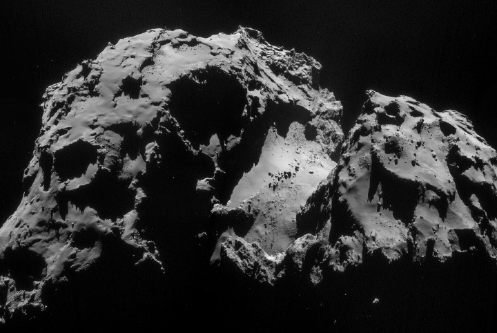
Airless bodies, like Comet 67P/Churyumov-Gerasimenko, are relatively easy to take pictures of. Credit: ESA/Rosetta/NAVCAM.
This is especially true for true-color (red, green, blue) imaging, because we know (or think we know) what to expect. Clouds are white, water is blue, forests are green, and deserts are yellow. Or red. Maybe brown. Even black if there happens to be an active volcano nearby.
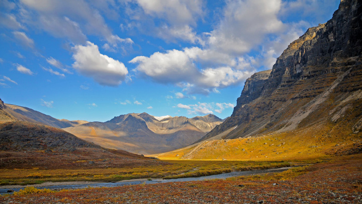
True-color imaging is hard because it’s familiar. We know what many landscapes are supposed to look like from personal experience. National Park Service, via flickr.
The atmosphere scatters light from the sun before it hits the ground (or a cloud, but we don’t care about those at the moment), and then scatters reflected light again on its way back to a sensor. The atmosphere even scatters light back into a camera that didn’t hit anything on the ground at all.
That would be challenging enough, but the atmosphere changes from one place to another (the air above deserts is typically dry, while the air above a forest is usually moist (even when not cloudy) and often filled with tiny aerosol droplets), and over time (a hazy summer day compared to a crisp fall evening).
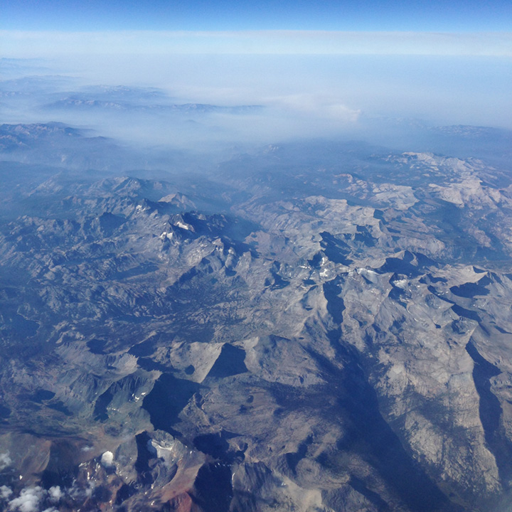
This would be so much easier without an atmosphere. And forest fires. (The Sierra Nevada from the air, enroute from Washington DC to San Francisco, CA.)
On top of this, what we see with our eyes is very different from the raw data captured by a scientific instrument or digital camera. Not only do our pupils open and close based on the amount of available light (think about the blinding brightness when you step into the outdoors from inside a dark room on a sunny day), but color and brightness are both relative—they change based on everything else in your field of view.
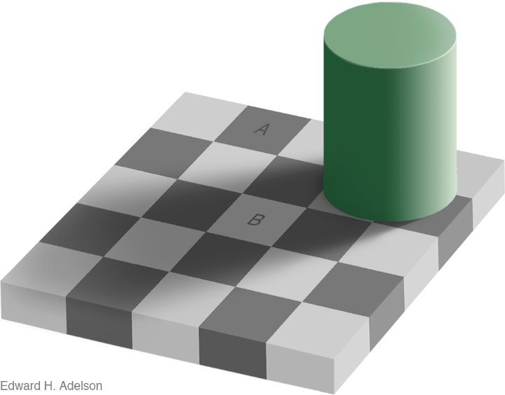
The squares marked A and B are the same shade of gray. Seriously. ©1995, Edward H. Adelson. This image may be reproduced and distributed freely.
Finally, satellite images of the Earth need to be adapted to the dynamic range and color gamut of display technologies (both screen and print), which are quite limited compared to the real world.
Because of this, it’s very difficult to do automatic or universal color corrections. For the very best results, do it by hand.
Color correction is the process of adjusting raw image data so the resulting picture looks realistic. It’s not a process of making a scientifically accurate picture—our visual system is too non-linear, and too mutable.
Conceptually, you can break color correction down into three facets: brightness (the overall level of light in an image), contrast (the relative light levels of adjacent areas in and image), and color balancing (adjusting the overall hue of an image). Brightness and contrast together can be considered tonal adjustments. In practice, these three elements are inextricably linked—changes in one facet affect the others.
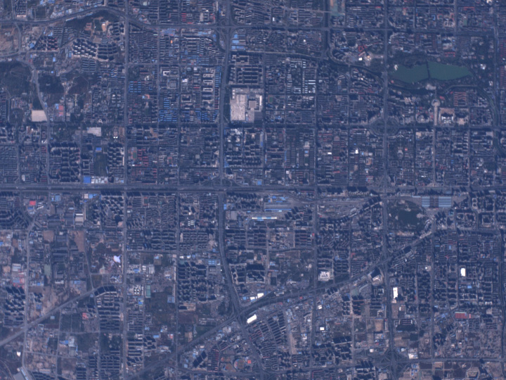
That said, how do you change an image of Beijing from this:
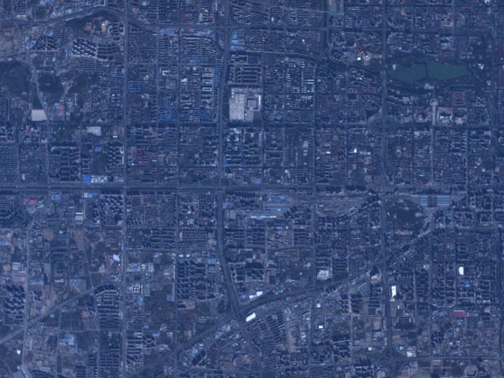
Looking at Beijing through 100 kilometers of atmosphere.
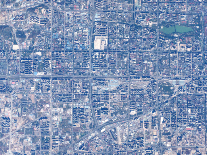
To this:
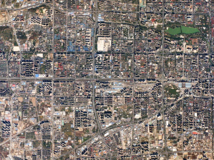
Beijing in color.
Step One
To get started, load up your image in Photoshop, or other image editing program of your choice. (I’m familiar with Photoshop, so it’s easier for me to explain how I work using it as an example rather than something like GIMP. That said, the process should be similar no matter what tool you’re using. Some scientific image processing applications also offer non-linear color enhancements, but they tend to be less interactive and more difficult to use.) The data are stored as 12 bits of information in a 16-bit-file, so Planet images appears very dark, even black, when first opened. To expand the data (originally 4096 values) to fill the entire range available in 16 bits (65,536 values) simply use the levels command:
Image > Adjustments > Levels
Change the number 256 to 16, effectively multiplying every value by 16. The image will likely still be dark (unless it’s primarily clouds or desert), but you will be able to see some features.
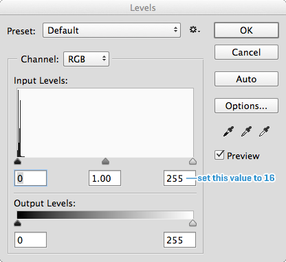
The Levels controls. Change “255” to “16”.
Step Two
The next step is to find something white, for a point of reference, and then set the relative maximum levels of the red, green, and blue channels in an RGB image so that the surface that should be white is white. I.e. white should be 255, 255, 255 in a 24-bit (8-bits per pixel) image. Fresh snow usually works best, but puffy clouds, clean salt pans, or a white roof are OK substitutes. If there isn’t a good white point (which is often going to be the case for a clear image) look at other scenes in the strip to see if you can find something suitable. In this case, I found an image a few scenes to the north of Beijing with a nice thick bank of clouds.
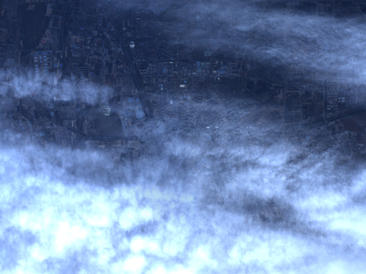
Clouds are a reasonably good reference for white, especially when they’re not completely saturated.
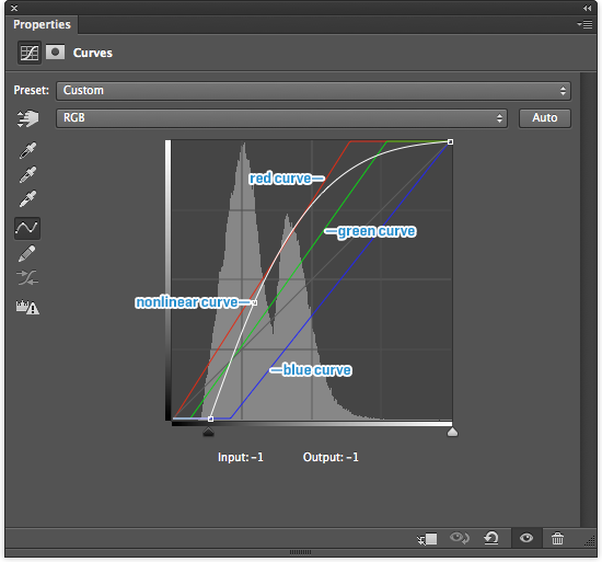
Go ahead and copy/paste the cloudy image on top of the image you’re working on. Then add a curves Adjustment Layer on top of all the image layers (rearrange layers in the layers palette by clicking and dragging), so you can make changes non-destructively. In other words, you can mess around to your heart’s content and still be able to undo everything with the click of a mouse.
Layer > New Adjustment Layer > Curves
You adjust the variables on the curve from the properties palette, which you get to by double-clicking the icon for the curve in the layers palette. [If none of this makes sense, track down a copy of Adobe Photoshop Classroom in a Book. It is the best introduction to Photoshop I know of.]
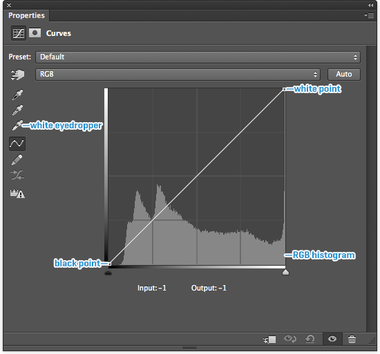
The Photoshop curve properties palette.
In the curve properties palette there’s a white eyedropper that (conveniently) sets any pixel you click on to white. Select the white eyedropper, then set the sample size to 3 by 3 Average (this will prevent a single outlier from affecting the image disproportionately). Now go find someplace, preferable someplace very bright, in your cloudy or snowy image that should be white, but isn’t, and click on it. Voila!
An important aside: because Planet Labs imagery sometimes saturates you need to find a clump of pixels where none of the three channels is already maxed out—red, green, and blue should all have a value less than 255. Keep Photoshop’s info palette open, it has a readout of the RGB values for the pixels your cursor is over.
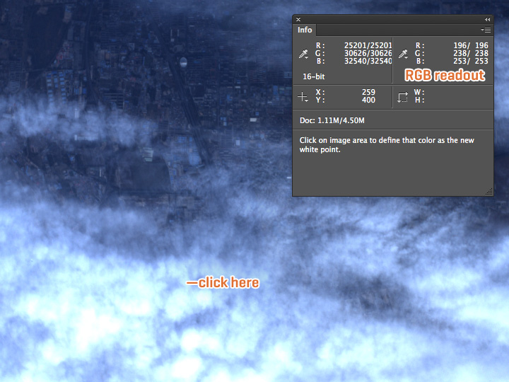
The original cloudy image, with Photoshop info window superimposed.
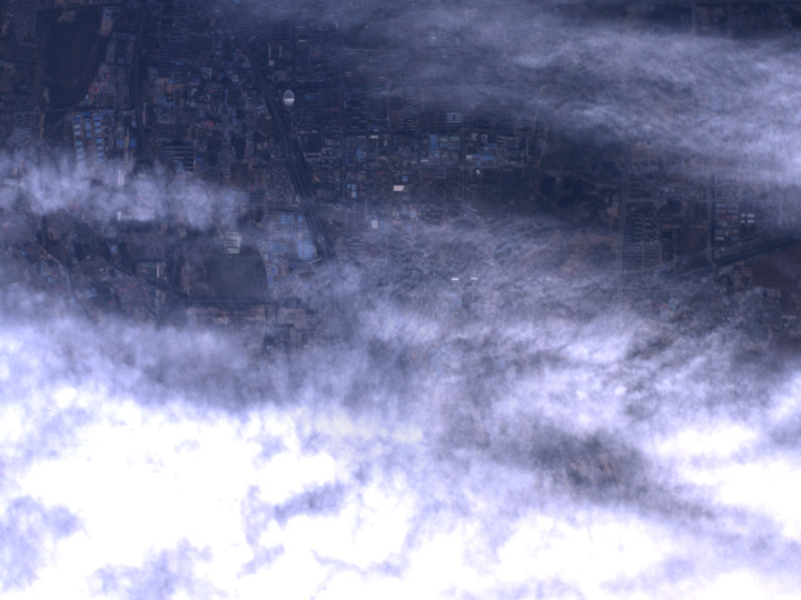
Modified image, after a white point is selected.
Step Three
Now you have an image with white whites, and light areas of the image should appear with the more-or-less correct hue. There’s even a way to check. With the white eyedropper still selected, and your cursor over the image, hold down the option key. This will display only the saturated pixels in an image. Pixels saturated in all three bands are white, only in blue are blue, red and blue are magenta, etc. Here’s what it looks like for our cloudy image:
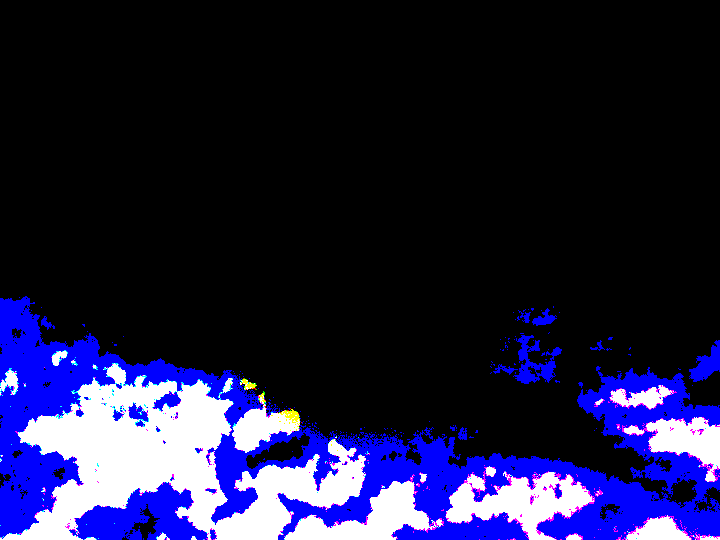
Fully saturated pixels appear white, pixels saturated in blue and red are magenta, etc.
Close, but you can tell by the remaining blue and magenta fringing surrounding the fully-saturated areas that there’s not enough green. Fix this by adjusting the white point of the green band independently of red and blue. (The white point is the open square on the top right of the diagonal white line in the curves palette. The white line is the curve itself. As long as it’s straight you’re making linear adjustments. When you add additional points and bend it, you’re making nonlinear adjustments.)
Pick the green band from the drop-down menu labeled “RGB”. This will reveal a green curve (that starts as a straight line) and a green histogram. Adjusting this curve will modify the green channel alone, which allows you to change color of an image, not just brightness and contrast. Changes that increase the relative amount of green make the image more green (obviously) while changes that decrease green shift the hue of the image towards magenta (red + blue). To adjust the curve, click and drag on it, or click on a point and use the arrow keys to change values one at a time. For most PlanetScope 2 imagery the value of the blue white point will end up more or less midway between the red and green white points.
Step Four
When the whites look good, it’s time to return to the cloud-free image of Beijing itself—just hide (click the eye icon in the layers palette) the layer with the clouds in it. Because the curve adjustments are independent of the pixels they are modifying, they’ll be applied to the Beijing image exactly as they were to the cloudy image.
Beijing, with white point corrections derived from the nearby cloudy image.
The next step is to adjust the overall brightness and increase contrast. Scattered light brightens the entire image, especially shadowed areas, so we need to make the darks darker. Grab the black point (the open square on the lower left end of the curve) and move it to the right. Every pixel with an overall brightness lower than the black point value will now be black (red = 0, green = 0, and blue = 0) and pixels that are brighter than the black point will be scaled accordingly. As you’re moving the black point, look at the histogram displayed underneath the curve: this shows how many pixels there are at each brightness level. Keep moving the point to the right until the slope of the histogram starts to get steep.
Regions without much topographic relief, buildings, dark rocks, or dense vegetation are not going to have any surfaces that are very dark (since there is nothing tall enough to cast a shadow), so don’t be quite as aggressive at setting black points in these cases.
This increases contrast (we now have both black and white pixels in our image, using the full dynamic range of the monitor), but you will still need to adjust the relative brightness of the image to correspond to the non-linear nature of our vision.
Step Five
Click near the center of the curve to add an additional point, then drag it up and to the left, changing the curve from a line into an arch. This expands the difference in brightness between darker pixels, and compresses the difference between brighter pixels—which mimics the way our eyes and brains process changing light levels. Keep moving up and left until the mid tones of the image look balanced.
White point plus tonal correction, but no black point correction. This means the shadows are brighter and bluer (plus a little greener) than they should be.
Take a look at the image. It should have light regions that are properly color balanced, the overall contrast should be mostly ok, and there should be contrast throughout the full range of brightness in the image.
Step Six
You’ll likely notice, however, that the dark areas are a lot too blue and a bit too green, and not quite as dark as they should be. This is because the atmosphere scatters blue (short wavelength) light more strongly than red (long wavelength) light. Correct for this by individually adjusting the black points for the blue and green channels. You’ll almost always need to move blue further than green. I always leave a little bit of blue in the darkest shadows, because the shadows we see at ground-level are also blue. I’m not trying to make imagery that’s scientifically accurate—I’m trying to make imagery that looks like the world we interact with every day.
The finished curve for this image.
This should result in an image that looks good, but not always great. Since each individual adjustment influences the entire image, you’ll likely need to go back and tweak the individual settings for each channel, or the overall shape of the curve. It may even help to add a second or third point to the combined RGB curve—just make sure that the slope varies smoothly. Knees or kinks are often visible either as regions of excessive contrast, or washed out areas.
The finished image. I’ve also increased the saturation slightly to make colors richer.
If you’re having trouble creating something that looks right, go to Panoramio or flickr and look for some ground photos. They can be an immense help, especially for regions with unfamiliar terrain. Keep in mind that landscape photography is often done near sunset or sunrise (the golden hour), and may be yellower and more saturated than it would be the rest of the day. Google Maps, Apple Maps, Bing, Mapbox, etc. are also good references, but they often break down at high resolution, so don’t take any of them as authoritative—trust your own eyes and experience.
Unfortunately, this method of color correction doesn’t scale too well beyond a single strip of data. We’re using it to enhance individual images for the gallery, and to inform the other techniques we’re experimenting with to craft seamless mosaics.
If you want to give this a try, here are some sample images (with preliminary data) to practice on. (You’ll need to right-click and download the images. 16 bits per pixel TIFFs won’t display in most browsers.)