
Experimenting with the Deep Data Stack: Ship Counting
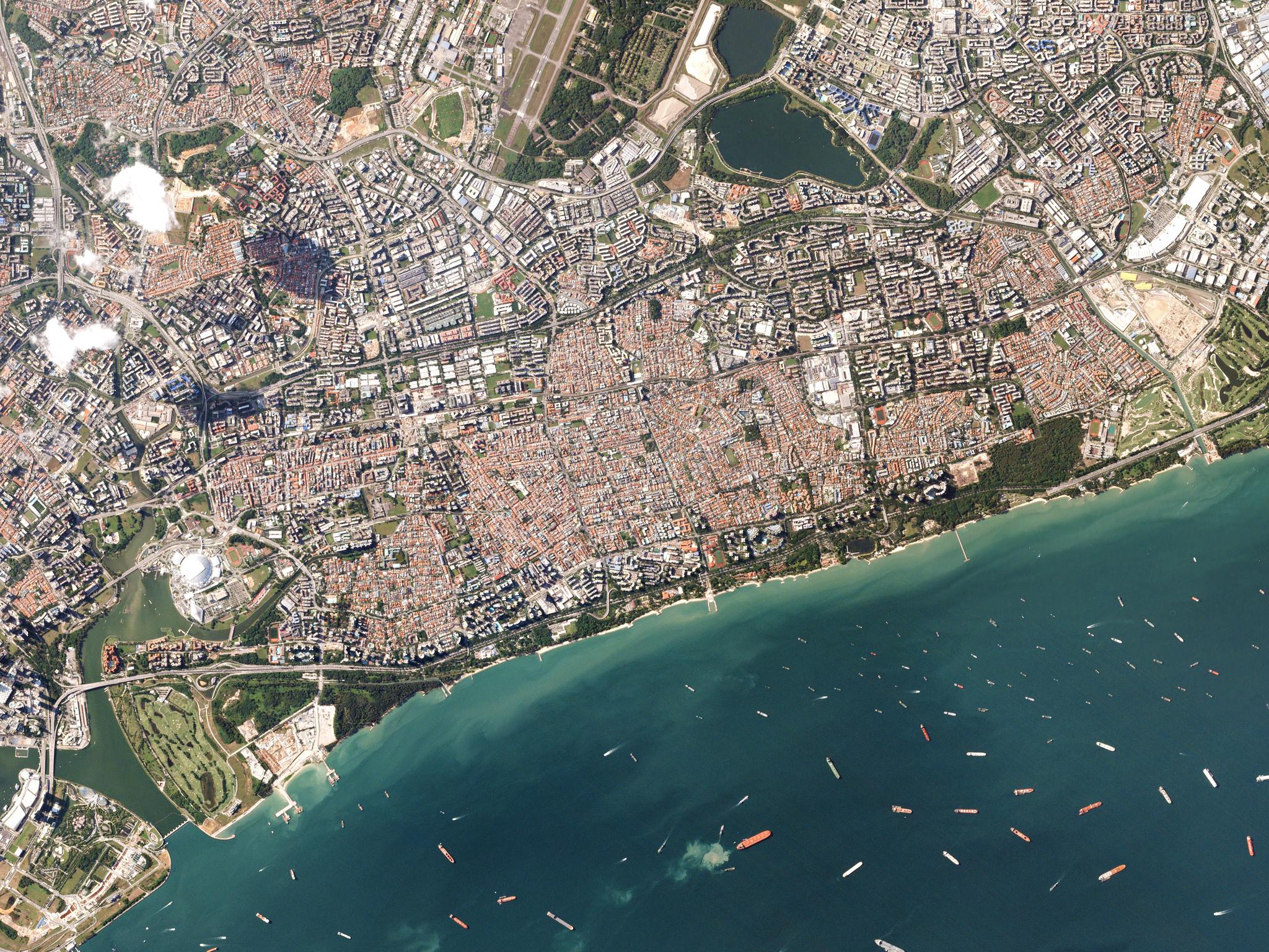
PlanetScope shot of Singapore port captures July 29, 2016 © 2016 Planet Labs Inc. All Rights Reserved.
TechPlanet is all about scale. Our satellites are small but numerous, the scale of our pixels ranges from 3 to 5 meters, and we’ve built some seriously scalable infrastructure to put 150 million square kilometers of imagery on the web every day. Mission accomplished, right?! Turns out you need good tools to really understand our changing world as seen by Doves. But a lot of analysis still happens via visual inspection of images; desktop GIS systems aren’t well suited to high-throughput analysis; and even customers operating in the cloud still have to make a copy of every image they’re interested in, which takes time and money. None of this scales very well to high-cadence imagery like Planet’s, so what is to be done? Working side-by-side with dozens of our users on a diverse set of use cases, we’ve been struck by the power of going from ideas to insights as quickly as possible—at scale. As a first approximation, a simple technique applied to the right data can go a long way—assuming you have the right tools. You may ultimately need to get more sophisticated, but you shouldn’t have to start there. How does this work in practice? Let’s explore two approaches for counting ships over time.
Why ships?
Ships are interesting because they’re the red blood cells of the global economy, carrying all manner of goods, natural resources, military personnel and equipment, and more. Keep tabs on ships, and you are keeping tabs on a huge amount of economic value and power. Of course, you can track ships via widely used AIS signals. But the most “interesting” things occur when AIS transponders are turned off—things like illegal fishing, human trafficking, smuggling, or sensitive military movements. This is where satellite imagery comes in.
First, some simple stuff
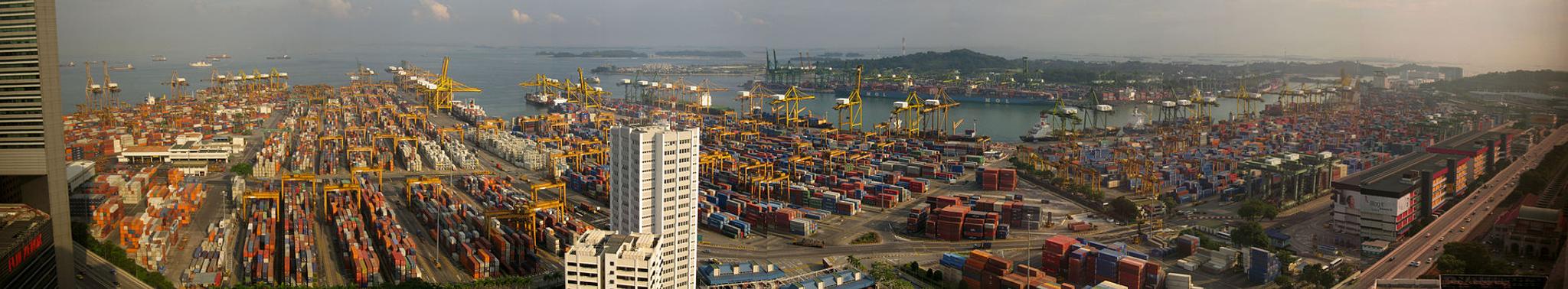
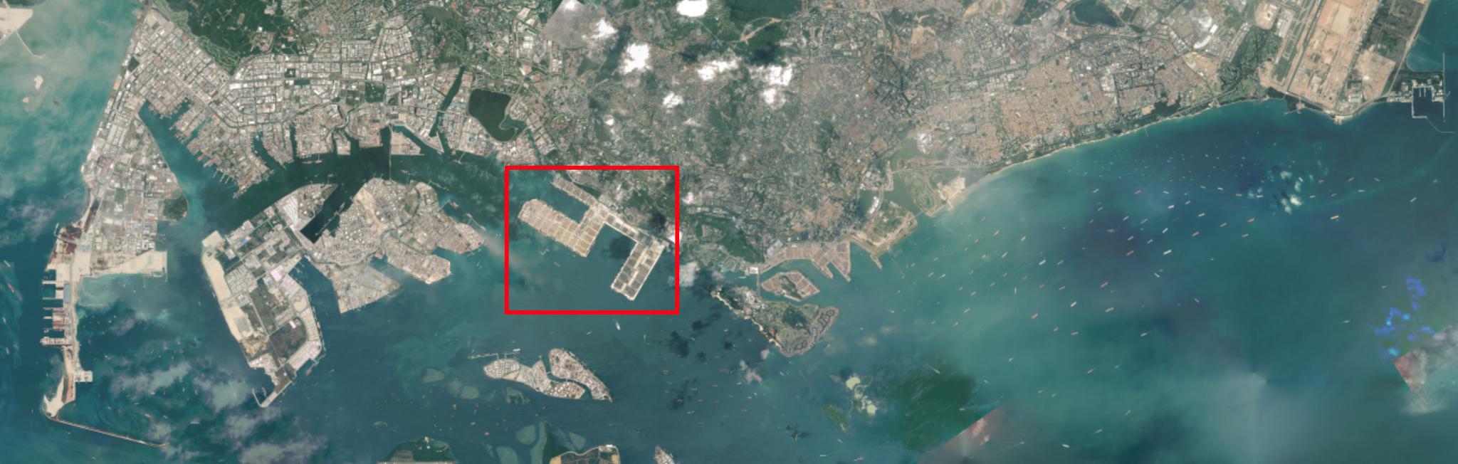
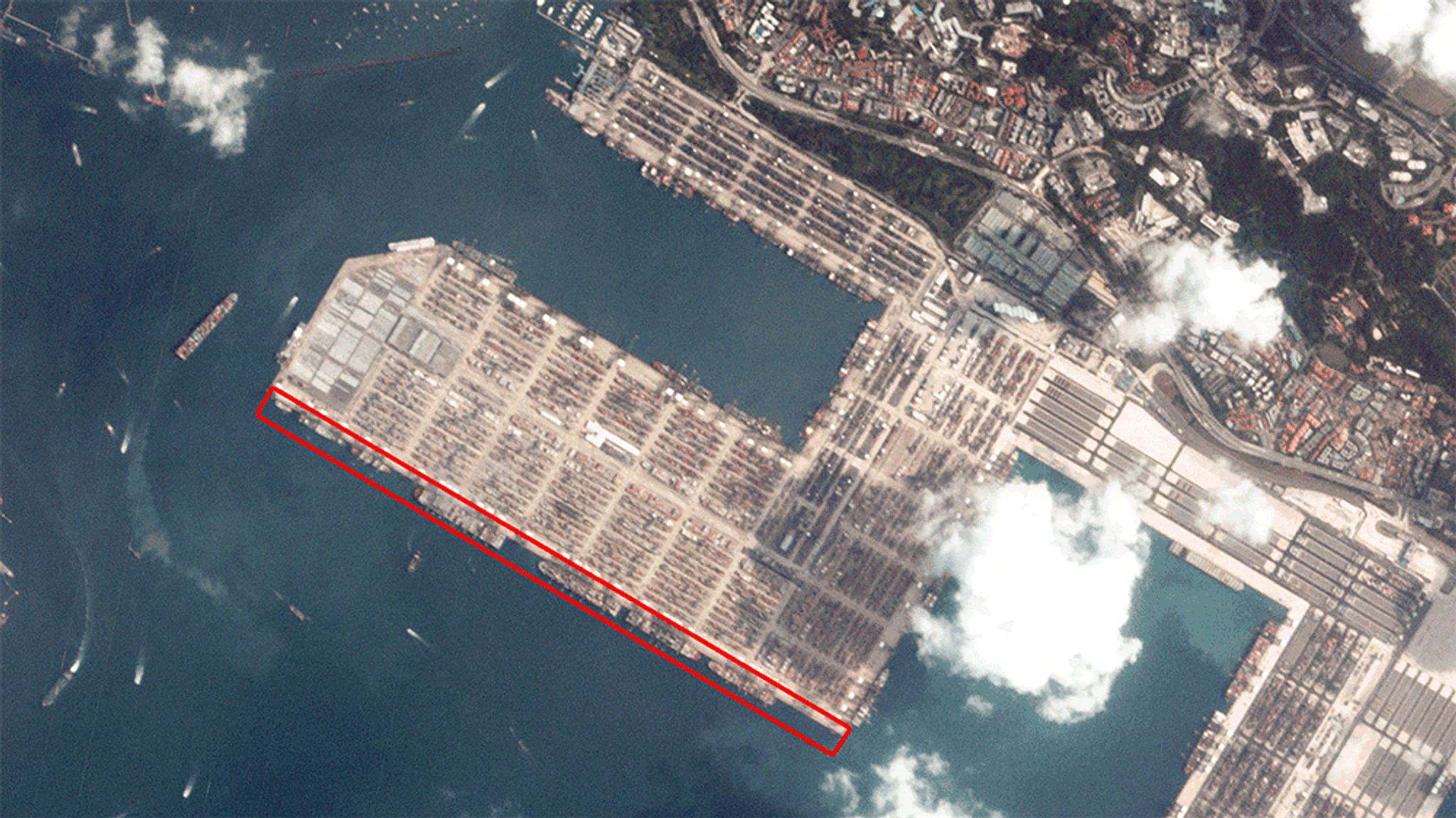
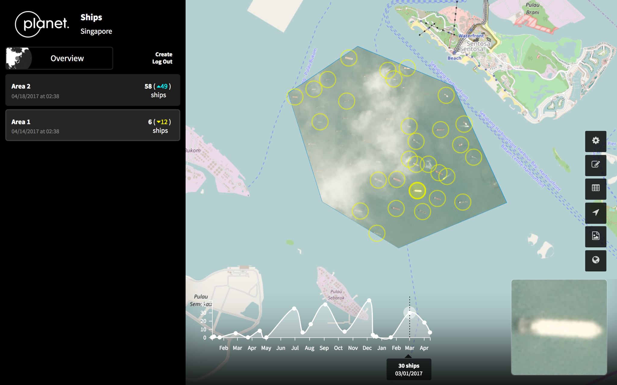
In the absence of a hot tip about illegal fishing, let’s have a look at the Port of Singapore, the backbone of Singapore’s economy. One of the world’s busiest ports, thousands of ships pass through the Port of Singapore every year. Let’s see what we can do as quickly as possible to count a few of them. We have consecutive PlanetScope shots of one of the massive container terminals on March 17 and 18, 2017. Let’s zoom in, to see how many ships are unloaded/loaded at the quai highlighted in red.
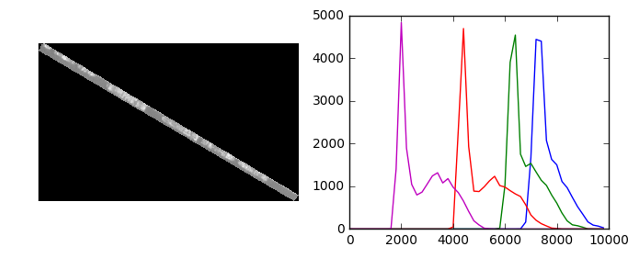

Kicking it up a notch
A colleague took this basic idea to the next level to count ships moored nearby. He took the band thresholding from the first example, mixed in edge detection and clustering, and drew a circle around each ship. This method is less sensitive to differences in lighting conditions and clouds.
What’s next?
At Planet, we’re producing a data set unlike any other, and it opens up fascinating new opportunities for analysis that push beyond the capabilities of traditional tools and techniques. So we’re working to automate analysis at scale, in order to help our users and customers discover and understand change across the globe. To paraphrase Alan Kay, from band math to machine learning, simple things should be simple, and complex things should be possible. If you’re interested in using Planet data to power your own analytics solutions, check out our Application Developer Program.
Ready to Get Started
Connect with a member of our Sales team. We'll help you find the right products and pricing for your needs