
Drying Up in a Flash: What Satellite Data Can Tell Us about Flash Drought Risks and the Regions We Should Be Watching
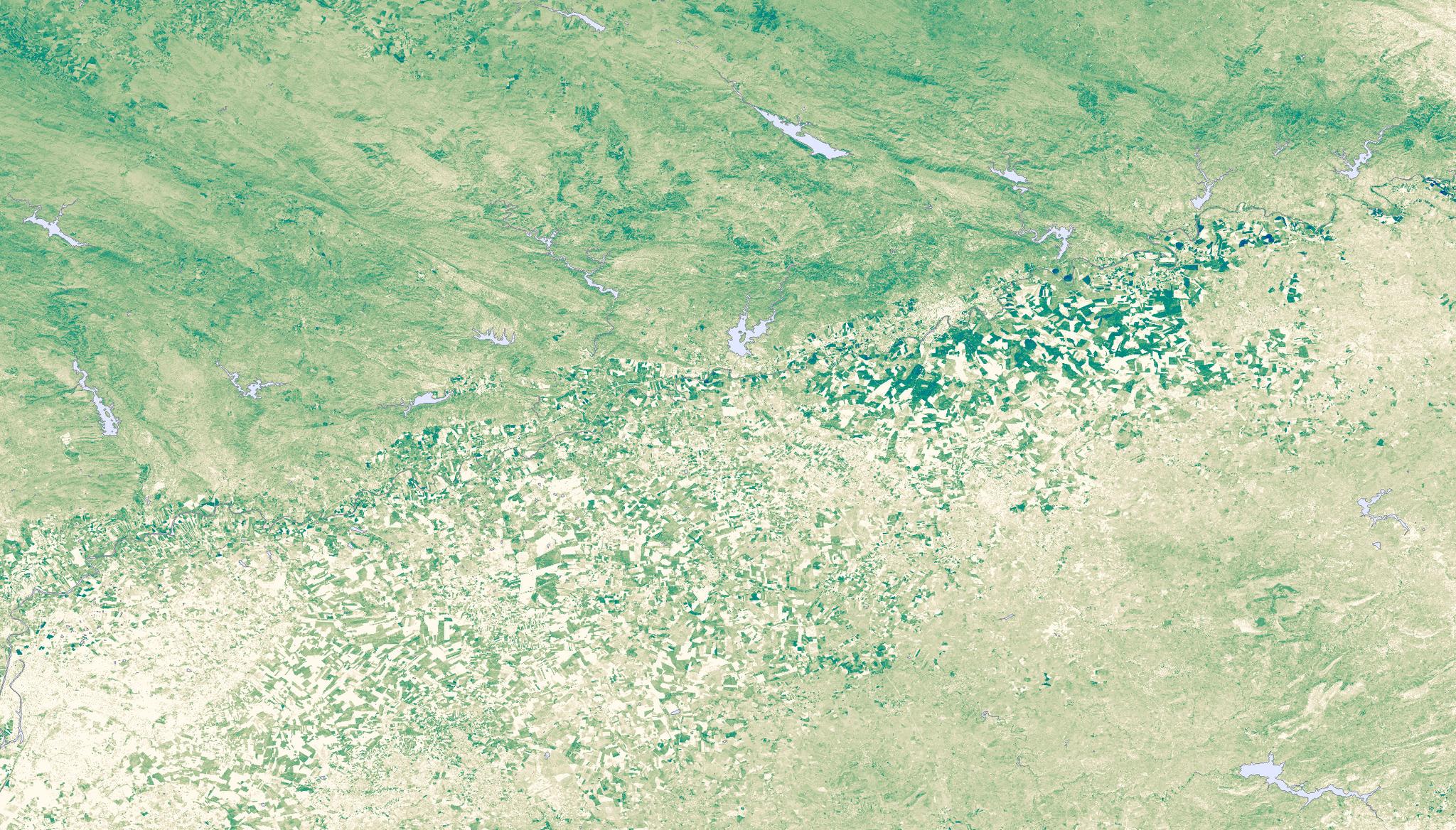
Planet Soil Water Content map of the Andalusia Region of Spain captured April 23, 2023. © 2023, Planet Labs PBC. All Rights Reserved.
StoriesAuthors: Stephen Levay and Megan Zaroda
Datasets generated and analyzed by Arjan Geers
Visualizations by Max Borrmann
Special thanks to Richard De Jeu, Maarten Lambrechts, Ryder Kimball, and Yoann Malbeteau
Worldwide, drought is arguably the largest overall antagonist farmers face. According to the Food and Agriculture Organization of the UN, the impact of drought is especially painful for agriculture in low-income and less-developed countries, where more than 34% of all agricultural losses can be traced to drought. The threat of drought is becoming even harder to predict, as well. A recent study showed droughts that form in just weeks – dubbed flash droughts – are increasing in frequency and speed. The ratio of fast to slow-developing droughts increased over 74% over the last few decades.
Exacerbated by climate change, what sets these flash droughts apart is that, coupled with extended periods of low rainfall, spiking heatwaves drive extreme evaporation. Imagine an insatiably thirsty atmosphere that gets so hot and dry that it literally sucks the water right out of crops and the soil.
While current monitoring systems including satellite data cannot predict where and when the next flash drought may pop up, we can use planetary forensics as an illustrative tool to gauge drought risk and identify regions that are particularly drought-prone. Based on a model run by Planet from February to May 2023, our Soil Water Content (SWC) data revealed flash drought conditions across:
- The Iberian Peninsula
- Eastern Australia
- Southern Africa, including Angola, South Africa, Zambia, and Zimbabwe
- Southeastern South America
- Southwestern United States
We’ll dig into the dynamics specific to those regions further as part of a multi-part series that will explore ways to use the global coverage of this dataset to reveal drought risks across the entire surface of the Earth. But for now, let’s look at the way we can harness Soil Water Content data to analyze rapid changes in global soil moisture.
How satellite data can reveal drought risk
Drought is a dynamic phenomenon, and Planet’s Soil Water Content, one of our Planetary Variables datasets, captures a snapshot of conditions that signal drought using granular, real-time measurements. Soil Water Content uses data collected by satellites launched and maintained by NASA, ESA, and JAXA that employ passive microwave data to calculate the percentage of water present in the top layer of the soil at enhanced resolution.
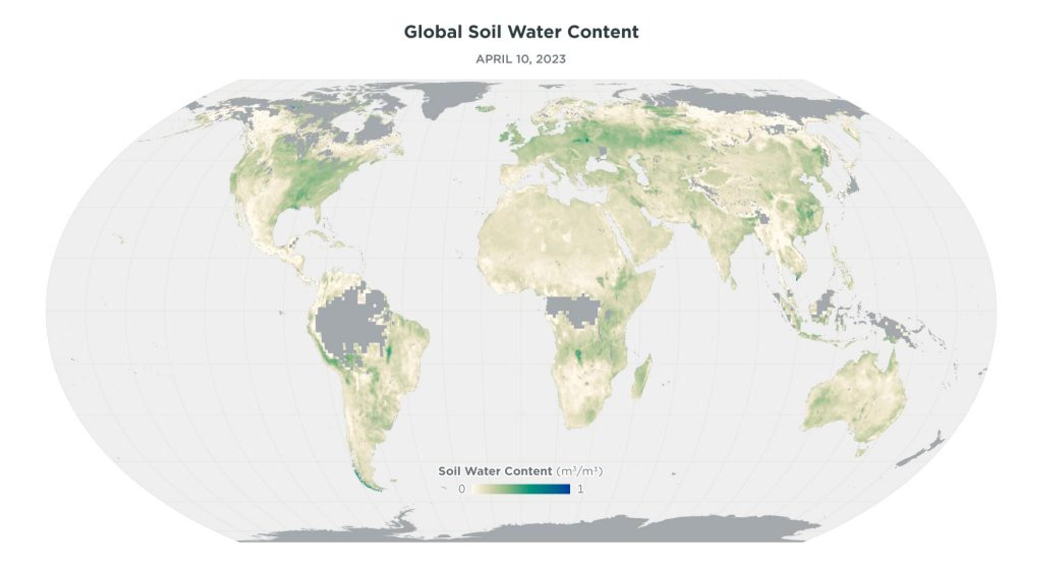
Figure 1: A snapshot of the water in global soils shows conditions on any given day, providing a reliable measurement that can be used to assess drought. A global image of Soil Water Content measurements indicating the average of a two-week time period in April 2023 for each individual pixel.*
To go deeper on where flash droughts are occurring, we’ve visualizedglobal measurements of SWC data over the course of an entire year, August 2021 – July 2022. The map presents dryer regions in yellow, while wetter areas are depicted in green. Stacking dozens of maps over the course of the year produces an animated version, and in that motion, clear regional patterns and trends emerge.
Figure 2: Stacking maps of Soil Water Content produces an animation that can unveil shifting drought conditions over time.*
Some basic seasonal patterns are clear: the annual spring thaw across the arctic, for example, or the summer monsoon in India. Consistently dry regions like the Sahara and Arabian deserts are also visible throughout the year. But it’s noticeable and concerning when some regions experience longer or more intense periods of dryness, like what the animation shows in the western US or Central China. Planetary Variables data stretches back for up to two decades, so we can compare regional patterns with historical context, as we did in a recent blog post about drought in the Horn of Africa.
Focusing on drought risk
Even without using archival data, our team was curious about using a technique to look at rapid changes in Soil Water Content (SWC). A team led by Dr. Eswar Rajasekaran used similar data to show that changes to soil moisture over specified intervals are closely correlated with drought-monitoring indices. Building on this work, our team built a dataset that indicated the change in SWC over a 28-day period, which we can use to build a map like the one below.
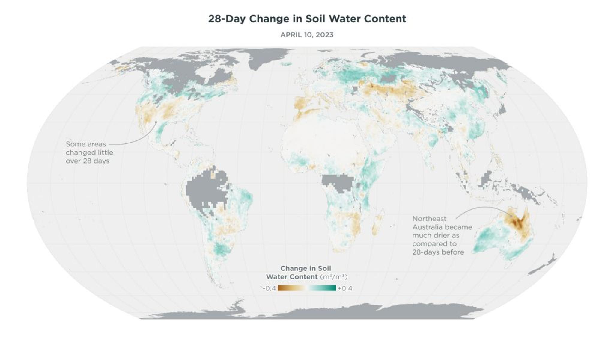
Figure 3: This image shows how much Soil Water Content levels changed from the previous 28 days prior to April 10, 2023. Increases are shown in blue and decreases are shown in orange.*
From the map above, the dynamics of regional drying become much more visible. Instead of just showing the level of Soil Water Content, we can identify critical changes in regions, like Northeast Australia, which are becoming significantly dryer. There, the soil became much drier compared to just 28 days before. This can signal a lack of precipitation, which can put a strain on water resources and create stress for crops or livestock. Other areas show little change over the same time period, suggesting that a lack of rapid drying is signaling relatively stable conditions. In the longer term, drying soil coupled with increased evapotranspiration (driven by air temperature and humidity), can lead to severe drought events. Because the speed of change can be correlated with drought intensity, measurements that can highlight where change is occurring may provide an early warning indicator for the onset of drought.
We can take this approach even farther. In the same way that we stacked multiple maps of Soil Water Content measurements, we can look at change over time to identify areas where rapid drying has occurred alongside already especially dry conditions. The result is an animation like the one below.
Figure 4: This animation shows areas that experienced rapid declines and were also especially dry – like the Iberian Peninsula and Angola – over the prior 28 day period from February 1, 2023 to May 12, 2023.*
We set specific thresholds for dryness and changes in soil moisture—for this animation, we isolated areas where the Soil Water Content was under 0.15 m3/m3 and the average decrease in SWC was above 0.12 for the previous 28 days. Visualizing the areas that meet those criteria over time show these rapidly drying regions in red, and as conditions continue to change, they fade away. These rapid-change areas can also be thought of as “hotspots”—warning indicators of potential flash droughts—that are highlighted much more clearly than a simple measurement alone. The Iberian Peninsula is one such example, taking on the hotspot designation in April, 2023. Likewise, much of southern Africa, including parts of Angola, Zimbabwe, Zambia, Botswana, and South Africa, cycle in and out of hotspot status from March through May.
All that shifting is still hard to pin down into a clear understanding of regions at risk of drought. However, by counting the number of days any given spot experienced rapid-change conditions, we can aggregate the effect to identify those regions that saw the most intense conditions.
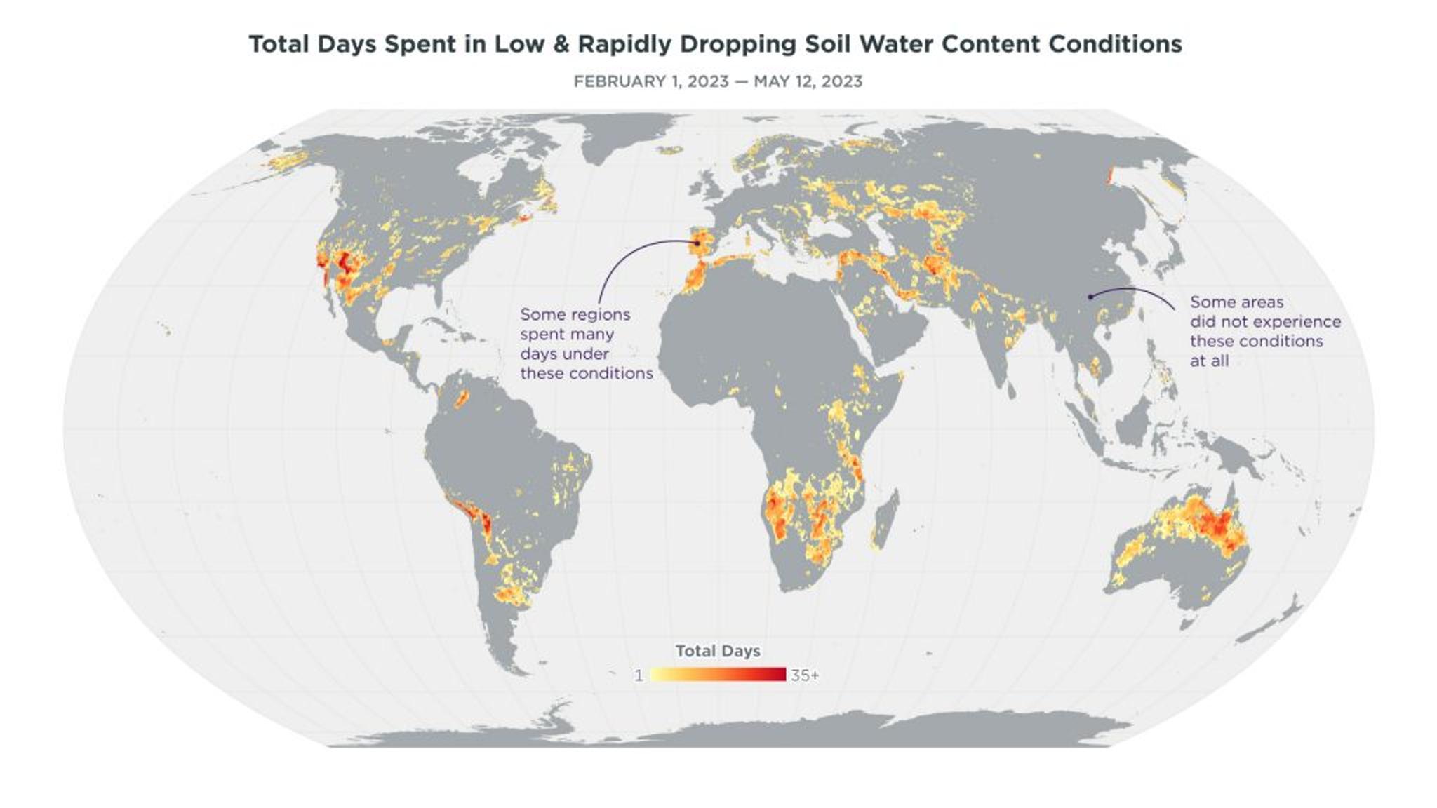
Figure 5: Isolating flash drought risk hotspots by measuring the number of days a region experienced the rapid change conditions. This map designates each pixel with a color based on the number of days it showed low and decreasing conditions from February 1 to May 12, 2023. In this visualization, 1 = 1 day, 30 = 30 days during that period. Areas that are darker red were in hotspot status more frequently.*
The map above (Figure 5) takes the same time period covered by the animation in Figure 4 and condenses it to a single frame, counting the number of days where any given region showed hotspot status. The more days in dry and rapidly increasing dryness, the darker red they become. Areas like the Iberian Peninsula appear as dark orange, having rapidly declined in Soil Water Content values. Other regions, like China, for example spent no time at all with hotspot conditions. Likewise, the Sahara Desert, while very dry, was dry consistently, so doesn’t get flagged as spending any time in hotspot status.
How to take action on drought risk data
We believe that tracking rapid drought changes like this can facilitate mechanisms that empower scientists and policymakers with earlier warnings, enabling proactive measures to mitigate the environmental and economic impact of droughts like water conservation or restriction. Giving a head start to policymakers can also help anticipate and mitigate financial losses, or develop assistance programs for affected communities. Drawing on this measurement can help allocate resources where they’ll be most effective in the event of drought.
Water managers, for example, can make allocations to more efficiently meet agricultural water demand or provide guidance about the amount of water available to farmers who need to irrigate their fields. Looking at rapid-change droughts also works really well for drought insurance modeling. For example, if there’s a prolonged drought, farmers know a harvest is likely to have poor yield anyway - no insurance company would insure you anyway; whereas differentiating early and rapid effects show different dynamics at play.
Drought risk data and modeling is also an important tool for those in wildfire management. Typically, those assessing wildfire risk are most interested in the top layers of soil as that’s where the most risk occurs. If SWC dips below certain thresholds, then the risk for wildfire increases exponentially. This type of SWC data can quantify the risk and help decision-makers do risk management since you can see both the historic data, your own threshold and dynamic changes. For example, if conditions are really dry and you see a scorcher of a weather forecast ahead, you can see what action needs to be taken, such as not allowing campers to enter the forest, enacting burn bans, etc. It’s akin to how life guards post a flag on the beach to warn you of riptides – drought risk indicators can be the signal of wildfire risk.
Stay tuned for future posts, where we’ll dive into analyzing some of the regions that saw the most rapid change effects and analyze them using historical data.
*Measurements at 1 km per pixel have been downsampled in order to render the image across the globe. Regions with significant vegetation, as well as frozen or snowy conditions, are not measured effectively with Soil Water Content data and so show no data.
Ready to Get Started
Connect with a member of our Sales team. We'll help you find the right products and pricing for your needs.